Monday, 15 November 2010

Saving files and Optimizing images

It is important to save files appropriatley in order to keep as clean, tidy and easy to use working space on any computer or portable memory storage device.
In the games industry 100 to 1000 (or even more) files can be used on a single project, all of these files wont just be used by one person either as they must be used by everyone who needs them and this can be several people!

There are several ways of keeping folders clean and organised, by keeping them apropriatley named it is easier to locate file locations which are relevant to you and others who need to access the files.
Also sub folders are imperative to keep documents orderly and neat, for example it would be a good idea to keep Photoshop work in a folder titled "Photoshop work" and the only files that should be in that folder are Photoshop files.
(Sub folders are folders within another folder).
Sub folders keep work dedicated to a relevant and easy to find area allowing the needed files to be found quickly and opened efficiently.
Lastly it is important to remember not to overwrite updated files, by saving updated files with a similar but different name to the last file you can show evidence of development.
Here are some work folders on my memory stick.


Within the "Photoshop work" folder are two sub folders
"Finished practice work" and "Incomplete work".


Within the "Finished practice work" subfolder is all
peices of work that have been completed for practice.
You can see how subfolders are useful in this case
as the finished work is easily seperated from
incomplete work making and easier working enviroment. 


Optimising images is very important, this is because different image versions are required for different purposes and through optimisation the image can be best suited to its purpose.
If an image was to be used professionally in a print campaign it would be important to make sure that the qaulity stays high, it would be important to keep the image at 300dpi and use a PSD file to ensure that important information on the image (such as layers) are kept.

Another important version of the file would be the one which the staff of the company view to see if they are happy with the product or not, again qaulity is very important so the staff can have a close resemblance to the finished product but another key feature is file size due to the file being uploaded to a staff intranet.
It would be a good idea to save in a lossless file format such as PNG.
It must also be taken into consideration that the image will be viewed on the web, so for this reason it would be a good idea to reduce the dpi to 72 which should help in reducing the file size.
Although the file size is smaller the image should keep its qaulity if optimised correctly.

In the scenario of a version of the print being needed for a main website on the internet (not the intranet as mentioned above) it is important to save the file in a lossy format causing the file size to be reduced further.
However doing this will cause image qaulity to decrease and the dpi will still be around 77.
If the image needs to be downloaded speed is a key element so the user should save the image as a JPG file.

In the modern computing world smart phones are wideley used by allot of people as they are good for when on the move and away from a computer.
When being considred to be used on a smart phone the file size is a primary target as fast downloads are critical.
The image file for a smart phone must be lossy and in JPG format, the dpi should be reduced also to around 60 dpi. (This should not make a huge difference to the viewed picture qaulity due to the image being viewed on such a small screen)
To conclude in making an image sutiable for a smart phone the colours should be reduced to 256 to decrease the file size even more.
If all of this is done correctly then the image should be easily viewable on smart phones with little or no problems at all.


Friday, 8 October 2010

Graphics tablets, scanners and cameras.

Graphics tablets:

Most graphics tablets are made by Wacom.
A graphics tablet is an input device which allows the user to draw into a computer programme such as Photo shop.
Graphics tablets connect through USB and are pressure sensitive, the more expensive the graphics pad is usually has a result of better sensitivity and a larger drawing area.
The cheapest graphics pads are around £50 and the more expensive models are around £3000.


Scanners:

Drum scanners range from £5000 to £10,000 and stand on the floor, they are relatively tall.
Flatbed scanners range from £30 to £300 and plug into computers, they are most often used to scan A4 sized pages.
The worst type of scanner is the handheld scanner, the user has to slowly move it over the area they wish to scan, any sharp hand movement could ruin the whole scan.

Overall hand scanners have poor resolution and are cheap usually priced around £20.

 DPI (dots per inch) is a very important factor to consider before purchasing a scanner as the more DPI the scanner has the better the quality of the scan, if you buy a scanner with low resolution and DPI the result may be very poor.

Digital cameras:

There are lots of key points to consider when looking to purchase a camera that effect the quality of the picture you take, for example mega pixels.
One mega pixel is the equivalent to 1 million pixels, the more mega pixels a camera has results in better quality pictures.
Optical zoom uses glass to zoom in and is generally very good, digital zoom on the other hand just enlarges the pixels making it not as good as optical zoom.
Lastly macro allows you to take detailed pictures of a very close up object and is well suited for gathering samples of textures from the real world to incorporate into a game world.

Camera phones  usually range from £20 to £600, they are quick and easy to use but give poor quality compared to dedicated cameras as camera phones are designed for convenience and quick snaps rather than quality pictures.
A camera phone averagely has around 5 mega pixels.

Compact cameras can be anything from £50 to £300, they are easy and convenient to use and usually feature a good amount of mega pixels.
Some compact cameras use digital zoom while others use optical zoom, it depends on the model and make in most circumstances.

DSLR (the cameras used by professional photographers and paparazzi) cost anything from £300 to £3000!
They provide the best quality photos and are very good for texture reference photos.
These cameras usually offer 20+ mega pixels and feature optical zoom 99% of the time.

One of many DSLR cameras.
Wacom Bamboo graphics pad.


A hand held scanner.

Sunday, 3 October 2010

Lossy compression:

Lossy compression is the term used when a image file is reduced in memory size and in doing so many colours from the image are "thrown away".
The colours that are removed cannot be restored so once they are gone they are permanently removed from the image.

Lossless compression:

This is the same method in many ways as lossy compression in which colours are removed from an image file to reduce the file size, however lossless compression has the advantage over lossy as the colours which are removed can be restored at any time making editing the image again if need be a relatively easy task.
File sizes are also allot larger than lossy files due to the increased amount of information being stored.
The overall difference is lossy compression permanently removes colours to reduce file size and lossless removes the colours also but gives the opportunity to restore them at any time.


GIF:

This stands for Graphics interchangeable format, this type of image file is largely used on images that feature allot of lines, for example maps.
Unfortunately GIF images are poor quality if used for photos and detailed pictures as the max amount of colours is only 256 and vector graphics are used, on the plus side due to this the image files are a relatively good size and they are in lossless format.


An example of a GIF image

PNG:

PNG stands for Portable network graphics, this type of image file uses lossless compression and is extremely suited for photos and detailed pictures, it uses Raster graphics.
It also offers features such as transparency but does not store any additional information.
The file sizes from this type of image are generally quite large due to the amount of detail.


A good example of a PNG image

PSD:

PSD is the image file that is used in Photo Shop, it uses lossless compression and has extremely high quality.
File sizes can be very large due to large amounts of information being stored such as layers, masks and transparency.
This type of file is very good for photos, the graphic type used is Raster.
TIF:

TIF is the term used for Tagged image file.
TIF files are high in quality and have large files, other information can be stored with the image and it usually uses lossless compression rather than lossy.

BMP:

BMP stands for Bitmap.
Bitmap images are not used by many people as the only software that really uses this file type is Microsoft paint, although the quality may be high no compression at all is used which results in a huge file size!

JPEG:

JPEG images are probably the most common type of file type.
Camera phones use this format but it should not be used for photos.
JPEG has 16 million colours and is relatively detailed with good quality.
On the downside it uses lossy compression so this image type cant be edited more than once.
A JPEG image

Monday, 20 September 2010

What is resolution?

Resolution is the term used for how many pixels go into one inch of the image on screen.
The more pixels per inch gives a higher resolution which would then result in better graphics.
The same concept is used with images and photos, the more pixels per inch result in a stronger and crisper image.
Resolution is also known as DPI, this is the abbreviation for dots per inch, it is necessary to use the correct DPI for the job, 300 DPI is used for printing and 72 DPI is used for work on screen.

What is a pixel?

A pixel is the very smallest, individual part of an image.
The image can be still like a photo or animated like a movie or game, pixels make up all images other than vector type images, however vector is not really used in games, films or any animations.
To conclude a pixel is a extremely small coloured dot, when pixels are combined they make the full image, however the closer the image is zoomed in the less quality it has.

What is bitmap?

Bitmap is the name given to a 2D image with a variety of pixel colours and combinations.

What is vector?

Vector graphics are relatively simple, they are made from simple lines, curves and polygons.
The graphics themselves are mathematical as the individual shapes are plotted and create by angles and equations which when finished give an image.
A great thing about vector graphics is that they do not use pixels so no matter how far in you zoom the quality maintains itself making it good for labels on product, however a downside is that because pixels are not use the overall graphical appearance is lower and there for not used with things such as photos and animations.


This is a vector image, as you can see
it keeps it quality when zoomed in.


Monday, 13 September 2010

Textures:

Textures give depth and emotion to 3D models in games and give us a sense of what a specific object would feel like in the real world allowing us to feel more enticed with the game.
For example a destroyed building would have lots of jagged and smashed pieces of brick in, on and around it so a jagged brick texture would give us a sharp, gritty urban feeling when in that area of the game.
Textures are used on everything in games such as characters, guns, foliage so its not just buildings, everything in a game uses textures and it i textures that give a game a relation to the real world no matter how wacky or far fetched the game may be from real life.
 Textures are made primarily in Photo shop, the textures start off as 2D images and they gain the 3D effect only when "wrapped" around 3D models.
This is a texture to a game
character, as you can see its flat (2D)
 
This is a blank 3D model without a texture.


As a result of adding a texture to a blank 3D model a life like
person is made, this is Gorden Freeman from the Half life series.


In game interface:

The in game interface is sometimes referred to as the "HUD" (heads up display) it is what the player sees and uses to play the game efficiently and with more ease.
For example in game interfaces include things such as radars/maps, text boxes, health bars, character level, ammo, scores etc.
The in game interface is the players life line as it basically shows the current status and well being of the players character as well as additions such as maps and radars which help players to navigate levels and areas much easier rather than getting lost in a level which fuels boredom and frustration, both of which games developers don't really want there customers experiencing!

The screenshot above is from Tom Clancy's Rainbow six Vegas 2,
this is showing a good example of in game interfaces.
Notice the XP and rank bar in the mid bottom, ammo and grenades
 in the bottom right and squad status in the bottom left, all are examples
from parts of an in game interface.

2D sprites:

A 2D sprite is  2D image or animation integrated into a larger scene of a game.
2D sprites are several 2D images put together so when animated they give the appearance of movement, for example the legs of the original super Mario are real the only thing on him that was animated with a simple motion.
Sprites where first invented during the mid 1970s and started to advance ever since moving from bitmap layers eventually to tile layers.
The very early sprites where extremely low detail compared to the gaming advancements of today, a good example of 2D sprites in games would be Super Mario.


A screenshot from Super Mario showing a very good example of 2D sprites.


3D isometric sprites:

3D isometric sprites are similar in some ways to 2D sprites, the difference is 3D sprites have multiple angles that are animated to face different directions.
The original Fallout game on PC developed by Interplay shows a very good example of 3D isometric sprites, the game appears to be 3D but really its just many 2D sprites put together giving the visual effect of 3D.

A screenshot from the very first Fallout game entitled "Fallout" from 1998.

Printed media:

Printed media comes in many forms such as posters, leaflets and magazines.
The purpose of printed media is to attract and entice an audience who will later go on to purchase the products advertised in the printed media.
Printed media must be attractive and stand out to gain attention and viewers, as well as this it must not have to much text as it gives the appearance that it would take to much effort to read so people move on.
A successful piece of printed media should be bold, stand out and be short and snappy quickly getting the point of the product to the customer.

The cover of PSM3 the official PS3 magazine
is a good example of printed media with lots
of colour.

Concept art.

Concept art is initial ideas that are usually sketched roughly and enhanced using CAD such as photo shop in conjunction with a graphics pad, there are many stages to concept art as developments are made all the time with different variates of the same concept, for example the different helmet alterations that we saw in the Mass Effect 2 concept art video.

Concept art is used primarily by 3D modelers to create their 3D designs.
The concept artists play a massive role in the design and development of games as it is there ideas that are made reality when the final design is put into a 3D modeling programme and later integrated into the game.
Similar to concept artist, textures have a similar role to play in the development of games as textures give depth and feeling to the game by adding "skins" to the blank 3D models and environments.

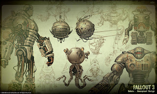
All the images below where created by the lead concept designer of Fallout 3 Adam Adamowicz.


Robotic character design
from Fallout 3


Concept art of architecture from Fallout 3

Miscellaneous and vehicle concept from Fallout 3

Tuesday, 7 September 2010

Different graphics types.

In the gaming world there are four different main graphics types, cel shaded, photo realistic, exaggerated and abstract.
Each type of graphics are totally unique and different from each other for example the cartoon effect cel shaded graphics give totally differ from the effect that photo realistic graphics give.

Photo realism is where the graphics of the game are created to look as real as possible, photo realism is used to make the game feel as close to the real world as possible, when
used in conjunction with advanced physics photo realistic games can prove an amazing, enticing experience.
A screenshot from Metal Gear solid 4 showing photo realism
Two examples of photo realistic games are Grand theft auto IV and Metal Gear Solid 4.


Cel shaded games are often full of bright water colour like graphics, the thing which makes cel shaded graphics unique is that everything from characters to buildings have a distinct black
outline.
This outline makes the graphics appear quite cartoon but fun and amusing to view.
A very good example of a cel shaded game is Borderlands, cel shaded graphics work very well with this games characters and environments ranging from desert wastelands to marsh green landscapes.
"Rack hive" from Borderlands
Abstract graphics from LocoRoco on the PSP

Abstract graphics are totally unique and not widely used, abstract graphics are often used more on game with little or no violence which are commonly aimed at a younger audience and gamers who
may generally enjoy more pleasant games rather than the common shooters of today.
LocoRoco on the PSP is a prime example of a game with abstract graphics.


Exaggerated graphics are mainly used on games with a manga/anime style.
There is often a massive range of colours and bright effects in games with exaggerated graphics, these effects can make the game very appealing and exciting to view.
Good examples of games with exaggerated graphics are Dot Hack, Dragon Ball Z the game and Naruto the game.
A screenshot from Dot Hack on PS2
All of these games where relatively popular on the PlayStation 2 and all are Manga/anime themed which shows a correlation between exaggerated graphics and manga art.
Dragon Ball Z the game

Monday, 6 September 2010

2D and 3D gaming

Over the years gaming has made massive strides in development, one of the biggest strides has been the upgrade from 2D to 3D gaming.

2D stands for 2 dimensional; the experience of 2 dimensional gaming is flat.
In 2D games the player can only move left and right as there is no depth to the game and in most cases very little effects.
A good example of a 2D game would be Metal slug, the player and enemies can only move left and right in a strafing position towards and away from each other, as well as this the background of the levels are totally still and canvas like.

A screenshot of Metal Slug.
The original Street Fighter

However not all 2D games are flat and paper like in appearance, for example the latest Street Fighter game “Street Fighter IV” adds a fusion of 2D and 3D, keeping the left and right strafing from the original full 2D predecessors of the game Street Fighter 4 gives a 2D perspective with the addition of added detail to the main characters such as improved shading and detail to clothing, muscles and hair.

3D gaming adds a sense of depth and texture to the game, with 3 dimensions you are able to walk anywhere you like within the game boundaries, take cover behind detailed objects such as buildings or crumbling structures for example.
As well as this you can pitch your player to execute actions such as peaking round corners, an action like this would never have been possible in older 2D games.
Terminator Salvation the video game is a very good example of how players in 3D games can use the environment as cover and peak in and out, as well as this the 3D environment and destroyed buildings make the game quite interesting.
Gears of War uses a similar cover system for the player where the 3D environments can be used to get the upper hand on opponents.

Terminator Salvation the game

Sams Digital Graphics Blog


I like the art work on for the cover of Army of two the 40th day because it shows a fair amount of action and gives a sense of where the game play will be set, in this case a city as we see in the lower foreground.

The art work relates to the game because it shows the two heroes Rios and Salem from the first game, showing both the characters’ together on the box art connotes the team playing aspect has been kept from the first game which was a major point in the game and that you never fight alone.

In my opinion the art work does a very good job of selling the game, this is because it is bold and the colouring is just right, the burning city emphasises the game will be action packed, in addition to this the character layout on front of the box with “army of two” in the centre brings back a feeling of how great the first game was and how good the second instalment will be keeping its originality but also adding something new (the 40th day).

The target audience for the game is people who like action games officially 18 and above, the game is also aimed at people who like to tackle scenarios with teamwork and different strategies which this game in my opinion delivers very well, for someone who enjoys a game with a lot of action and involvement (emphasis on the weapon and mask customization which makes the player feel more unique and involved.)

I strongly believe the game hits the target audience; this is because it lives up to the originality of the first Army of Two game with the team work aspect, even if you’re not playing a friend sitting next to you in the same room the option to play online with strangers from across the world or even with the amazingly advanced and clever AI team mate makes the game an involving and exciting one, in conjunction of lots of decisions to make the game gives a truly unique action packed experience!